#animated background html css
Explore tagged Tumblr posts
Visit Tumblr Blog
Explore Tumblr blogs with no restrictions, modern design and the best experience.
Last Seen Tumblr Blogs


Fun Fact
Tumblr was named as a finalist in Lead411’s New York City Hot 125 in Aug 2010.
Text

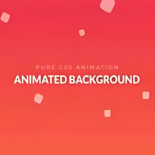
Animated Background with HTML CSS
#animated background html css#css animated background#css animation examples#css animation#css animation keyframes#learn to code#html css#code#frontenddevelopment#divinectorweb#html and css#html#css#html5 css3#frontend
1 note
·
View note
Text

Animated Background CSS
#animated background css#css animated background#html css#codingflicks#css#css3#html#frontenddevelopment#frontend#learn to code#css animation snippets#css animation examples
2 notes
·
View notes
Text

CSS Blur Background Image on hover
#css blur animation#css blur background#css animation tutorial#html css animation#html css#codenewbies#html5 css3#css animation examples#css blur background image on hover#css#frontenddevelopment#pure css animation
8 notes
·
View notes
Text

Day 2 - 100 Days CSS Challenge
Welcome to day 2 of 100 days of css challenge, where we will be together getting a given image result into reality by code.
We already know the drill since we did the first challenge, now let's get right into the different steps:
First step : Screenshot the image and get its color palette

No crazy color palette here, we only have two colors
White
This shade of green: #3FAF82
To make things more organized and get used to coding in an organized way, even if not doing it here wouldn't make any difference because we only have two colors, in more complex projects we would have a lot, we will define our colors at the beginning of our CSS code (well, only the green in this case):
:root { --main-green: #3FAF82; }
And this is how we'll use it whenever we want:
color: var(--main-green);
Second step : Identify the image elements
What elements do I have?
Three lines: line1, line 2, and line 3. I'll add them to my HTML starter template, again I'll leave the frame and center there:
<div class="frame"> <div class="center"> <div class="line-1 line"></div> <div class="line-2 line"></div> <div class="line-3 line"></div> </div> </div>
Third step : Bring them to life with CSS
Applying the background color
Only one line should be changed in the CSS code already added to .frame class:
background: var(--main-green);
So this is what we have going on for now :

Creating the lines
Now let's create our lines; if you noticed I gave each one two classes line-number and then line. I'll use the line class to give them all the common properties they have such as the color, height, width, position, border-radius, and shadow. And then I'll use the line-number to move them wherever I want using the left, top, right, bottom properties of an absolutely positioned element in CSS.
Let's start by creating all of them:
.line { left: -45px; position: absolute; height: 9px; width: 100px; background: white; border-radius: 10px; box-shadow: 2px 2px 5px rgba(0, 0, 0, 0.2); }
And just like this you'll see this in the browser:

You only see one line because the three are overlapping each other, and that's why we'll move each one of them exactly where we want using this:
.line-3 { top: 22px; } .line-1 { top: -22px; }
Now our static menu is ready:

Creating and analyzing the animations
As of observing, we can see that:
Line one goes down to line 2
Line three goes up to line 2
THEN line 2 disappears
THEN lines 1 and rotate to create the X
line-one-goes-down animation
This is my line-one code in the static version:
.line-1 { top: -22px; }
What I'm trying to do here is simply a movement translated by changing top from -22px to it becoming 0px:
@keyframes line-one-goes-down { 0% { top: -22px; } 100% { top: 0px; } }
line-three-goes-up animation
Again, I'm trying to go from top being 22px to it being 0px:
@keyframes line-three-goes-up { 0% { top: 22px; } 100% { top: 0px; } }
line-two-disappear animation
Making disappear simply means turning its opacity and width to 0:
@keyframes line-two-disappear { 0% { opacity: 1; width: 100px; } 100% { opacity: 0; width: 0px; } }
I'm gonna apply these animations and see what happens , before I create the rotation animations
.center.active .line-1 { animation: line-one-goes-down 0.5s forwards; } .center.active .line-2 { animation: line-two-disappear 0.5s forwards; } .center.active .line-3 { animation: line-three-goes-up 0.5s forwards; }
forwards means that the element will stay in the final state after the animation and not return to its original state.
This is what applying those three animations looks like:
Last but not least : let's Create the X
We only have to animations left for this: rotate-line-1 and rotate-line-2. Let's create them:
@keyframes rotate-line-1 { 0% { transform: rotate(0deg); } 100% { transform: rotate(45deg); } } @keyframes rotate-line-2 { 0% { transform: rotate(0deg); } 100% { transform: rotate(-45deg); } }
And that is my friends how we finished this challenge!
Happy coding, and see you tomorrow for Day 3!
#100dayscssChallenge#codeblr#code#css#html#javascript#java development company#python#studyblr#progblr#programming#comp sci#web design#web developers#web development#website design#webdev#website#tech#html css#learn to code
18 notes
·
View notes
Text

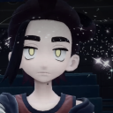
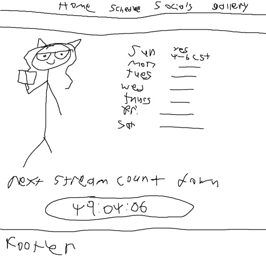
Hello world! Do you like Programming? Do you like Streaming? Do you like Vtubers/Anime? Does a combination of the 3 sound slightly interesting to you? Do you enjoy all these questions I'm asking? If you answered yes to any of these questions then why not hop by Sunday September 17th at 11am CST to watch me (@EribyteVT on twitch), A backend software engineer try and implement a website using only HTML, JS, CSS, and these images I made in MS paint!


[Image ID: A screenshot of the Vtuber Eribyte on a black background. She is from the chest up looking away from the camera with a smile. She is wearing a tank top and labcoat. Her hair is long, wavy, and gray. she is holding a book /.End ID]
[Image ID: 3 Images of a basic drawing of a website can be seen. The first image is the schedule page, which contains a stream schedule and a count down until the next stream. The next image contains the socials page, which shows several social media site names with squiggles underneath them. The last image shows the home page./.End ID]
147 notes
·
View notes
Text
neocities heracles trials: from a chaotic newbie
okay so i want to actually start posting here and i finally got it through my thick skull that this is LITERALLY A BLOG. i'm supposed to blog. so here's a blog post.
anyways, for context, i've been working on my neocities for a while now, recently started over to make things more original and more me. another thing to note is that i'm using VScode.
the issue here is that i have zero well not exactly zero but i lack any professional/academic background experience with making websites. the html isn't the issue (thankfully) but holy shit dude...css+javascript implementation . basic styling with css is no biggie, right? absolutely, however...may i introduce: smooth transitions + the absolutely tragic fact that the <marquee> tag is deprecated an accessibility issue.
so, my first goal day one was to recreate a marquee animation through css. so i tried to simply implement this incredibly useful bit of code into my site (in which if you're interested i totally think my failure to get it working was user error so please check it out it works great if you're not me) but, lo and behold, despite me getting it to work in my V1 project, i could not, for the life of me, get it to work. so i, not too familiar with css animation and completely lost when it comes to javascript, started grasping at straws. i ended up finding this tutorial and, with some improvisation since the tutorial is for webflow and i'm manually writing everything, managed to make my own css recreation of a marquee effect essentially from scratch, and even learned about the animation-play-state css attribute so i could pause the effect when the marquee is hovered over! victory, basically.

then, i looked around the many cool and absolutely awesome sites on neocities to get inspiration, and then i was like "hey what if i made a custom button background image" and with some trial and error, made myself a pretty decent base (for now) with aseprite, and learned more about the program in the meantime which is always a plus.
then i decided that i wanted to do more with the buttons. i wanted to make it animate on hover. not too hard right? you'll...you'll see why i struggled...in a moment...
anyways, i settled on a simple shrink animation. which THIS i could do with ease, messed around a bit, got the keyframes, assigned that to the button:hover and all of that and all was good!...until i realized that once i stopped hovering over it, it snapped back to its original scale instead of transitioning smoothly again. THIS is where the "fun" began.
see, although i can wrap my head around things easily when it comes to css, i have to constantly look up what the proper syntax for everything is because otherwise i'll mess everything up. and through my research i had conducted (aka surfing through multiple blogs and reddit posts alongside other things on random forum websites) i had discovered the very neat transition attribute.
but we'll have to return to this because i have adhd, and i ended up getting distracted during this process. see, originally i had decided that the button would change it's visual to appear like it was pressed when the user's mouse hovered over it. then i was like "i don't think this makes sense" so i changed it so that the button wouldn't change its background image unless the user actually clicked on it. so i did that. then i had to make sure that the button wouldn't magically scale up again so i had to transform the styling and blah blah blah those details aren't really that important ANYWAYS the actual important bit about this is that if you use the transition attribute and there's a change in background images that change will also be transitioned unless you set the transition to only apply to a specific change. and i didn't know that originally. so every time i tried to fix things up with a transition so the button wouldn't snap back to it's original size out of nowhere the background would slooowly change as well and i actually got so frustrated with this that i wanted to burn something down because that's a totally normal reaction i guess. anyways, then i started frantically searching for answers on the topic and EVERY. SINGLE. THING. THAT I FOUND. INCLUDED JAVASCRIPT.
i do not know javascript. i have not learned anything about it unlike css and html. it SCARES me and it is FRUSTRATING. but i thought i'd try it anyways. news flash that shit didn't work at all and i almost thought about scrapping the animation entirely especially when it randomly stopped working when i made certain changes, but i ended up eventually figuring out what i mentioned earlier (CSS transitions and the fact that you can assign them to only affect a specific change instead of everything) so with some dabbling here and there i eventually managed to finally figure out how to make everything smooth through pure css and although it still snaps if the element hasn't finished animating i'm happy with it.

moving on to another thing, i wanted to then make a sound effect play when you click the button. yes, we are still talking about buttons. THIS i could not do with css, like, at all. javascript admittedly is for interactivity and i had already been bending the rules quite a bit with the animations since those teechnically should've been done with javascript as well but this? this was impossible without javascript. so i found a free mp3, and searched up a nice little tutorial on the very basics of javascript.
little did I know that apparently, this would be my own personal little hell.
see, no matter how many times i tried a different script, the sound just would not work like at all. i'd do everything in what i assumed to be the correct way, and no matter what, it would not play. knowing that i'd just have to revisit this, i decided it was best to just sort of put it on the back burner.
and this is where i wish i could say this is the end of my absolutely gobstopping rant. however, i cannot.
see, one thing that i really like that i've seen in a lot of other people's sites is draggable windows. i think they're sick. but this ALSO requires javascript, but i didn't think this could POSSIBLY be that bad since so many people did it.
...right?.......right? guys. right?
MOTHERFUCKER I WAS SO WRONG.
see, it turns out that a lot of people do this sort of thing with jQuery, specifically for user interfaces. but vscode doesn't have a "user friendly" way to get jquery to work with it. and because i don't want to mess with program files, i decided that logically speaking jquery just makes writing things in js scripts less complicated and doesn't introduce things that are impossible in vanilla javascript so i decided i could suffer a little bit and try and do things without jquery.
this led me to looking at many sites with draggable windows to look at their own scripts, in which every single time i tried replicating things i FAILED.
i eventually stumbled upon a nice code that worked. but the issue with it - in which unfortunately i can't find it, else i'd link it - is that it works with not only element classes but also a specific ID. see, this would be fine if i only wanted ONE draggable element. but i want multiple. and i thought that maybe if i just duplicated the script and dedicated it to a different ID and changed function names it would work but nooo life cannot be this easy apparently. so after setting up my webmaster status window, getting that to work, i tried doing the aforementioned method for what will eventually be a guestbook of sorts. it failed.
so i decided, "hey i'll revisit this later!!" and i went on to finding a way to implement a status widget into my site. this honestly was really easy as i ended up stumbling upon status.cafe . so i registered, eventually got my account activated, and i got it working in my live port of vscode just fine!! all is good in the world.
well that's what i thought until i found out that since i had created my neocities account in march of 2024, and i'm unemployed since i'm still in high school hence i have a free account, that i could not. use the widget. in neocities. so i tried finding a work around, found this handy guide (which is genuinely useful by the way) and set up things through a RSS feed instead which is essentially just a work around that complies with the security restrictions of neocities that i'm bound by. anyways, this works great but i literally just can't customize it to how i want so this is another fail. then i find imood.com which, although is NICE, doesn't suit what i want on its own. so i'm at a loss here too.
so, again, another thing to put to the side i suppose.

so i started working on getting my guestbook, browsed through people's homepages again, and found chattable . and you probably think i have another paragraph complaining about this but honestly i can't write about something when i can't figure out how to even create a chat to implement onto my site in the first place so...y'know.
plus, i honestly have no clue if it'll work on my site either due to security restrictions so this is fun!!
anyways, after dealing with all of this, i finally decided it was about time i ported what i had so far over onto my neocities account. which isn't actually that hard i just had to wipe all of my files, overwrite the content in my index.html file there and paste in what i have now, and then upload my new files. but for some god awful reason after i went through all of this chrome just. kept depending on my old stylesheet??? so i had to clear some of my browsing data and eventually everything was loading properly for me.
and THIS is finally the end of my ridiculous documentation concering my neocities adventure so far.
i have no doubts i'll end up ranting here AGAIN about all of this but for now this is all i have on my plate...besides finally caving and learning javascript for real and continuing to learn more about html and css. hopefully one day i'll stop having such frequent issues but now is not the time and i doubt that'll be anytime soon either.
moral of the story, if you want to start something new and pick up a new hobby, please for the love of all that is of substance in this world don't go in completely blind like i've done if you're going to be making a project of some sorts. it will only lead to many misfortunes.
anyways you can see what i currently have done in my neocities here, make suggestions or give advice in the notes and whatnot i don't know.
#neocities#rant post#rant#coding#web development#geocities#html#html css#htmlcoding#css#javascript#losing my mind#holy shit#send help
6 notes
·
View notes
Text
[ARCHIVED]
Hello hello, Tumblr!! I, TT, am the author of Apocalypse Abandon hosted on MSPFA!
This is a post asking for help with said comic! Currently, I am looking for a background artist, and anyone familiar with CSS/HTML coding! The work should be fairly simple however I do not have the income to pay a wage or anything like that. You will never be trapped working on it, though, and you are so free to back out any time!
Even if you believe yourself to be bad/average/etc at those skills, I would still love to have you on board if you want to expand them and improve along with me and the rest of the team (of uh.. two people right now haha). Below the cut is a short plot summary (without too many spoilers) and a few pieces of art (art will come as it is made and be uploaded here) you can peruse to see if you'd be interested in helping out. If not, i humbly request your reblog so I can find ppl who are :3
Apocalypse Abandon is a fancomic taking place (originally) on Earth C. It is very much meant to mimic Homestuck and sort of bring back some of the nostalgia of the Early Days whilst still showing a new, interesting story! It starts four main characters at first: Jule Jackson, Cris Warner, Xael Grison, and Remy Lalonde. These four, on the 13 of April 202X, are alerted by the Godtiers that it is their turn to save the universe by creating a new one. Despite half of the party (Xael and Cris) living in a post-apocalyptic Earth C overtaken by plant life, they manage to make it work! Jule is a gentle young lady with a green thumb and a love of crafts. She is the most active online and the youngest of the bunch. She is both clever and kind, a Sylph of Time, a savior. Cris is a bookworm, and even lives in a library! He is a big fan of Rose's work, having read everything she ever wrote on her adventures and SBURB. He is strict and precise, a Knight of Mind, an archivist. Remy is the "son" of Roxy Lalonde. He is a direct genetic replica of her, and yet tries his best to be his own person. He is not so fond of his mother, who has fallen victim to existentialism and back into bad habits. She has become something of a mad scientist these days, mixed with a cat lady. Remy is a shy and mindful young boy, he doesn't know what is future holds. A Page of Void, an opportunity. Xael is a little rascal, sometimes seeming more animal than human. That’s exactly how he likes it! He scavenges for food, chipping his teeth on bones, and sleeping soundly curled up in the catacombs. He is ravenous and rabid, a Prince of Doom, a destroyer.
I dont have a TON of the plot planned out, as I prefer to write as we go along. I am always open to suggestions from anyone and happy to co sider them!!
Once again, PLEASE at least reblog this, especially if you read this far. It would seriously help me out so insanely much. Thank you for reading!!!
#tt talks#help wanted#css#html#html css#html help#css help#homestuck#fancomic#fan comic#homestuck comic#homestuck fan comic#mspa#mspfa#mspfanventures#fanventure#need help#homestuck next gen#next gen#sorta#please reblog#looking for artists#looking for coder
29 notes
·
View notes
Text
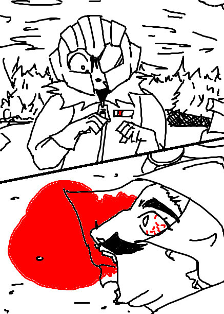
HEADS UP!!!
This drawing contains mild gore and limb dislocation on a victim of a fall accident. It is not intended for children or those who are queasy about that sort of thing. There's a dove inside, don't eat it!
Now that those who don't wish to consume this are gone, ahem.
If you wish to make this experience better (or worse for yourself), have some background music! This is what I listened to as I drew all this. If I lose my reputation or people unfollow me IDC this shit was fun even if I myself wanted to throw up.
youtube
Anyway, good luck in there soldier.

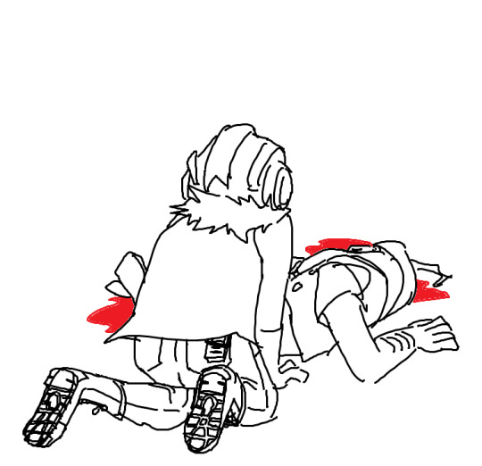
"The General is Dead"
or is he? [cue moon men by jake chudnow]
did you know im ambitious? im sure you guys could tell by this point im a man with high ego big plans that never get done. welcome to big plan i will never get done number 20 million, a mixed media ao3 creative writing fanfiction that'd probably kill a small animal if it were to try and break it down using its brain
this is just a snippet of a scene i want to have executed possibly. switches from a chaotic writing style to this very solid moment to let you just like. sit in silence and stillness for just a mere moment before it devolves back into the oddities that is this childs mind
obviously if you played the game this scene is for the aftermath of the thunder tower incident, where his ass slipped on a banana peel. the events in this story play out a bit differently, so things arent exactly as you would expect. this is a major turning point in the narrative for cl
in general i dont think people fully process how horrible a fall accident really is, and i wanted to encapsulate that in this drawing. the trauma behind witnessing it, the way the blood slowly pools out of the skull, i wanted to really encapsulate the trauma behind it by mixing a sort of realistic style with the planned generic style of the work
you'll also notice that cl's design is different here. i change his design whenever im writing him for specific concepts or such, if i consider it derivative off of my canon then it gets its own design
the speech bubble is empty because im gonna be using this for testing more css+html tricks in ao3 bcs thats genuinely so fun i highly recommend getting into html + css its an interesting experience
ok thats all the rambling uh sorry you had to see this sorry i have the balls to post this, and if you ignored the warnings and really werent considering your own sanity then thats on you bud LOL ok ciao
#tw blood#tw g0re#cw blood#cw gore#art#mother 3#the masked man#masked man mother 3#fassad mother 3#<- i cannot stop drawing this man#and i feel bad#im going to draw them happy now#tanejineri
5 notes
·
View notes
Text

Animated Bubbles Background
#animated bubbles background#animated background#background animation#vanilla javascript#html css#divinectorweb#css#html#animation#css3#code
6 notes
·
View notes
Text
Animated Background CSS
#pure css background animation#codingflicks#html css#frontend#css#html#frontenddevelopment#css3#webdesign#css animation snippets#animated background css
3 notes
·
View notes
Text

CSS Background Loop Animation
#css background animation#css animation examples#html css#codenewbies#html5 css3#css#pure css animation#css animation tutorial#frontenddevelopment#html css background animation#animated background css#css animated background
3 notes
·
View notes
Note
hii i tried following that one forum post for a splash screen that you mentioned before in an ask, i didnt really understand it TT could you make a version for dummies? thank you!
Hi Anon,
Do you mean this ask? about this Forum post? I'll try to make it easier then, cause it mainly is some copy-pasting and some light editing.
The Splash Screen, more explanation
The code from the post will create an element that will cover the whole page, and be triggered every time the game loads (or the tab refreshes).
So first, get on the Forum post, and copy the code in the correct places:
Stylesheet
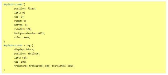
JavaScript
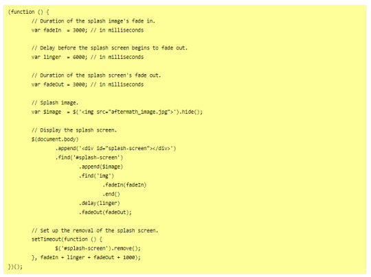
---
Then you will want to edit it to customise it for your project. There is code to change in both block of code:
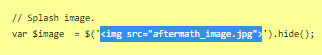
In the JavaScript, you will need to indicate the correct image you want to display on the screen, or any other element (like text).
In the Stylesheet, you will want to edit the colour of the background (and potentially the text colour) to match the vibe.
JavaScript
Here, you will want to edit the correct URL of the image you want to have on the screen.
If you want text instead of the image, you can do so by wrapping it with a < p > markup (or other relevant HTML markup):
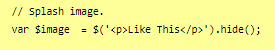
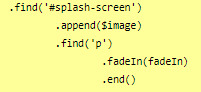
though, you will need to edit one more thing to make it work, in the .find() line, like below (p for the < p > element, and so on):
StyleSheet
The biggest change you'd need to make for the code in the style sheet will be with the code below:
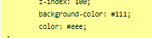
currently, the colours match the basic SugarCube UI colours. So if you've changed the UI palette for your project, you will want to edit those colours (background especially, color is only useful for text)
If you are not using an image, but some text in your splash screen, you will also need to edit this part of the code, to replace the img with the correct HTML markup:
(in the example above, you'd need to change the img with p)
Testing
One important thing afterwards, will be to test the splash screen (for colour, position, or even animation). Note: if you are coding in Twine and used a local image in the splash screen, don't forget to publish to file and open the HTML, rather than test/play through Twine/
If you want to test the Splash Screen, and fiddle with the CSS with the Inspect Tool of your browser, I advise you change the amount of this line in the JavaScript:
Add a bunch of zeros to increase the time (but don’t forget to remove them before uploading your file anywhere).
---
Hope this helps!
27 notes
·
View notes
Text

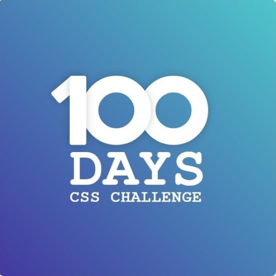
Day 1 - 100 Days CSS Challenge
Welcome to day 1 of the 100 Days CSS Challenge! In this challenge, we'll bring a design to life using only CSS. Our goal is to recreate the image we're provided with on the challenge page using HTML and CSS.
On the challenge page, we see:

A small preview of the design we need to replicate.
A starter HTML template.
A submission form to showcase our work alongside others who have taken on the same challenge.
Let's dive into the process step by step.
Step 1: Screenshot the Image
The first thing I always do is take a screenshot of the target design. Even if the design includes animation, having a static reference helps me focus on the basic structure and colors. Here’s the screenshot of the design we’re aiming for:
Step 2: Extract the Color Palette
Next, I identify the color palette that we'll need. This helps ensure that we maintain consistency with the original design. Here’s the color palette I’ve created:

Step 3: Identify and Create the Image Elements in HTML
Now that we know the colors, I break down the elements in the image:
Background: This is a linear gradient.
The 100 number: This is the main challenge, and it will require some work.
Text: “days css challenge,” which we’ll place to the left of the number.
Here’s the HTML structure for these elements:
<div class="frame"> <div class="center"> <div class="number"> <div class="one-one"></div> <div class="one-two"></div> <div class="zero-one"></div> <div class="zero-two"></div> </div> <p class="sentence1">days</p> <p class="sentence2">css challenge</p> </div> </div>
Now that the elements are in place, CSS will bring them to life.
Step 4: Bringing the Elements to Life with CSS
Linear Gradient
To create the background, we’ll use a linear gradient. Here’s a basic syntax:
background: linear-gradient(to <direction>, <color-stop1>, <color-stop2>, ...);
Parameter 1: Direction/Angle
This defines the starting point of the gradient. You can either specify a direction (e.g., to top, to bottom) or an angle (e.g., 90deg, 180deg).
Direction options:
to top
to bottom
to left
to right
If you want more precision, you can specify angles:
0deg: Gradient starts from the top.
90deg: From the right.
180deg: From the bottom.
270deg: From the left.
You can also combine two directions, specifying both horizontal and vertical movements, like to left top or to right bottom. This means:
The first keyword (left or right) controls the horizontal movement.
The second keyword (top or bottom) controls the vertical movement.
For example:
background: linear-gradient(to left top, red, blue);
This gradient starts at the bottom-right corner and transitions toward the top-left.
Parameter 2: Color Stops
Color stops define how the gradient transitions between colors. Each color stop specifies a point where a color starts or ends. Here's an example:
background: linear-gradient(to right, red 10%, blue 90%);
This means:
The element starts at 0% fully red.
By 10%, the transition from red begins.
Between 10% and 90%, there is a smooth blend from red to blue.
At 90%, the transition to blue is complete, and the remaining part is fully blue.

Once we understand the concept, we can apply the background we need. In our case, the gradient flows from the bottom left to the top right, so the code will look like this:
background: linear-gradient(to right top, #443DA1, #4EC3C9);
Bonus: Stacking Multiple Linear Gradients
You can also apply multiple gradients on top of each other:
background: linear-gradient(180deg, #f00, #0f0), linear-gradient(90deg, #ff0, #f0f);
Step 5: Making the "100" Number
Creating the Zeros
We start with the zeros. These are simply circles created using CSS. To make a full circle, we use border-radius set to 50%.
The white border gives it the appearance of the number zero.
.zero-one, .zero-two { position: absolute; height: 100px; width: 100px; border-radius: 50%; border: 24px solid #fff; box-shadow: 0 0 13px 0 rgba(0,0,0,0.2); }
This gives us a nice circular zero. We adjust their positions using properties like left and top, and manage the z-index to make sure the zeros stack correctly.
.zero-one { z-index: 8; left: 17px; } .zero-two { z-index: 6; left: 100px; }

Now both zeros are positioned, and they overlap in the way we want.
Creating the "1" Number
The number "1" is made of two div elements:
One-One: This part represents the slanted part of the "1".
One-Two: This is the straight vertical part of the "1".
What make the one-one element slightly slanted is
transform: rotate(50deg);)
the one-two is created simply with a little height and width nothing too particular then it is placed directly on top of the slanted part, giving us the full "1". Its z-index tho has to have a higher value than the slanted part of our 1 to ensure it stays above the slanted one.
Step 6: Adding the Text
For the two sentences “days” and “css challenge,” the styling is basic CSS. You can achieve the look with just a few font changes, some padding, and adjustments to font size. It’s as simple as:
.sentence1,.sentence2{ text-transform: uppercase; margin:0; padding:0; } .sentence1{ font-size:82px; font-weight:700; } .sentence2{ font-size:25px; font-weight:700; margin-top:-20px; }
And just like that, we’ve completed day 1 of the 100 Days CSS Challenge! Each part of the design is carefully crafted using CSS, giving us the final result.
Happy coding, and see you tomorrow for Day 2!
#100dayscssChallenge#codeblr#code#css#html#javascript#java development company#python#studyblr#progblr#programming#comp sci#web design#web developers#web development#website design#webdev#website#tech#html css#learn to code
16 notes
·
View notes
Text
I learned a lot last year, and I decided to challenge myself with making this needlessly gimmicky landing page for my Perchance generators.
It's completely custom-made, from the animated background image based on a Hitman 3 screenshot to the handwoven CSS and HTML.
Don't ask me how many times I was THIS close to screaming, crying, throwing things.
There a still a few things I need to tweak, but it's good enough to share as is, and I need to overcome my stupid perfectionism anyway (she says, after having spent the last few hours adjusting one stupid margin).
I'm so happy with how it turned out, and I'm so glad I didn't give up when the needlessly gimmicky things I wanted to implement were more complicated than anticipated. :D
(I'm sure there's a lesson to be learned somewhere in here.)
12 notes
·
View notes
Note
Anon so this doesn't come from my main but it's nsfruitw- I LOVE YOUR BLOG CODING OMG??? THE WORKING BUTTONS AND MOVING WINDOWS ARE SO AWESOME???? I'm so excited for Dee's ask blog!!!
<OOC:>
Ahhhhhh!!! thank you!!! I had three different potential blogs.. but a lot of them didn't really met my wishes/criteria.
Which in case you're interested were:
Windows 98 look
Search bar
Visible tags
One Column
Separate Window for your Profile Info with a picture. (maybe separate icons or a lil menu for links)
No endless scrolling/seperate pages
I will put everything else under the cut since the post became quite long haha
This was one of the first themes I tried out (tbh I kinda jumped between all of them, trying stuff out)
I loveeee the start bar on this one, the icons and that it can be one or two columns. But it has no search bar and I didn't like that the profile section is super small, has no picture and couldn't be swapped to the left instead of the right side. I'm not confident enough in my html/css skills to competently yoink that start bar and transplant it into a different theme
Pros VS Cons: + animated start-bar (with accurate time in the corner) + one column (or two columns) + Windows 98 look + functional corner buttons + icons + custom background picture - no search bar - tiny info profile window, no picture (can't be moved to the left side) - endless scrolling - no visible tags

I prefer this theme for the most part over the previous one.. even if i loveee the functional startbar feature there! Its practically perfect. it can be one or two columns (i prefer one column blog layouts personally) You can add a lil picture in the profile section, its on the left side and you have a search bar!
I also looooveee that the post windows look extremely accurate and that the tags are always visible. (< another thing thats often kinda hidden in themes, so i tend to forget about it) Also the lil corner buttons can actually be used to like or reblog the post! what a highlight<3. my only issue was that i couldnt add a background picture.. and i kinda liked the idea of having separate icons for obvious links like I do now.
Pros VS Cons: + Windows 98 look + functional corner buttons + one column (or two columns + No endless scrolling (page by page) + Left side Info Window with picture and links + Visible tags
- no custom background picture
Another theme that I tried out is this one
They made the same theme I ended up using. It has a built in music player (that wont auto run!) a profile section + picture, customizable icons and background. But the biggest thing for me is that it doesn't have a search bar and I really need/want searchbars in my themes.
It's a really solid theme! It just fell a lil short for what I wanted to have
Pros VS Cons: + Windows 98 look + one column + No endless scrolling (page by page) + Left side Info Window with picture and links + Visible tags + music player (bonus) + custom icons and custom background picture + custom lil link window
- no searchbar (my biggest issue with a lot of themes haha)
Okay so last is the theme I ended up using which is this one:
It's very similar to the previous theme (Nostalgia 98) and was made by the same person. I edited the code a lil to have the tags be visible instead of needing to hover and to add another icon for links. It works but it��s also the only icon that isn’t draggable haha
Pros VS Cons: + Windows 98 look + one column + No endless scrolling (page by page) + Left side Info Window with picture and links + custom icons and custom background picture + custom icons for custom links
- no visible tags (I edited the code a lil so they're permanently visible)
5 notes
·
View notes
Text
Build with the power of code without writing any - Webflow
When you start a business, having a website is primordial. It’s useful to promote your products but also to introduce to your audience new products you made, what are your goals, and why you created this business/brand. But building a website without knowing how to program is quite difficult, even impossible for certain people. It happens to me. It was hard when you don’t know where to start. Then I discovered Webflow, that’s why I want to introduce this website to you.
Webflow allows you to take control of HTML, CSS, and JavaScript in visual canvas, generating clean and semantic code that’s ready to publish or to give to developers. It’s a cloud-based, “software as a service” (SaaS) design tool that runs in a web browser. The principle is easy: you design the website, and they generate the code, for everything from fully custom layouts to complex animations.
Webflow: https://webflow.grsm.io/website_creation
You can design a site from scratch in Webflow, but if you’d rather use a template and make it your own, you can choose from over 2,000 in the Webflow template library. Webflow’s templates are presented in various categories — for example, portfolios, design, blogs, medical, and e-commerce. The templates are of very high quality; they are modern and aesthetically pleasing. They include pre-built elements like data capture forms, background videos, and online store pages — and all of these are fully customizable.
#business#developers & startups#entrepreneur#programming#marketing#website customization#website creation#website
3 notes
·
View notes